Citadel Colour Contrast – Part 2
So after the overview of the history of Citadel Colours, let's get painting and see how these work.

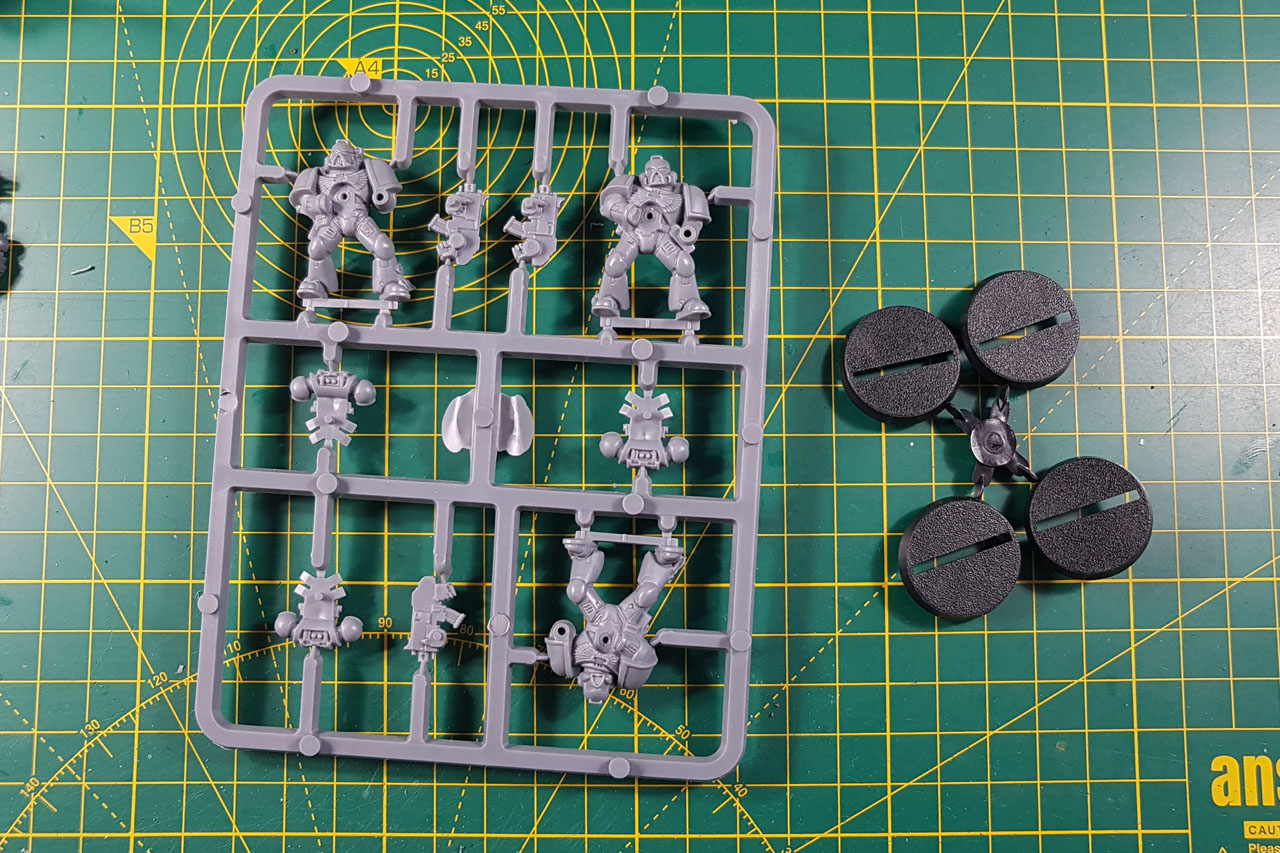
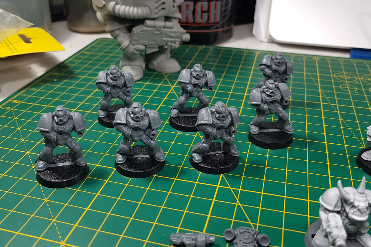
To get to know these new paints better, I prepared a couple of miniatures to be painted, among them the regular snap-fit Space Marine. Why did I choose these models? First of all, the Space Marine is the standard miniature associated with Games Workshop and Warhammer. Yes, it is getting replaced more and more by the Primaris Marines, but it is probably still the most numerous Games Workshop miniature there is. And the other reason, and that is the more important to this, it has a lot of different surfaces to show how the colours work, what they can do and what they cannot. You have larger flat surfaces on the Space Marine power armour, like the legs or shoulder pads, but rather detailed parts like the backpack. That enables me to show different situations on a single miniature with a single coat / run of a colour.
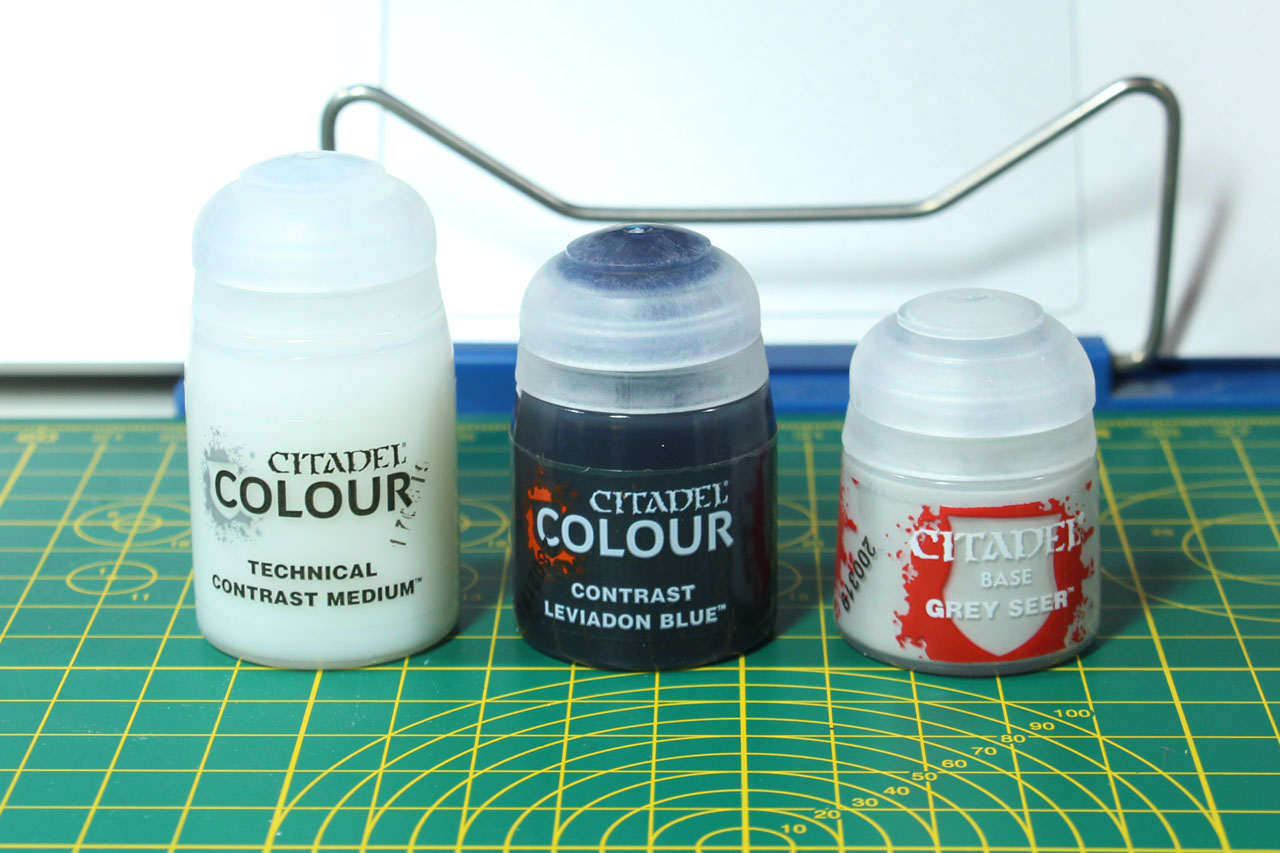
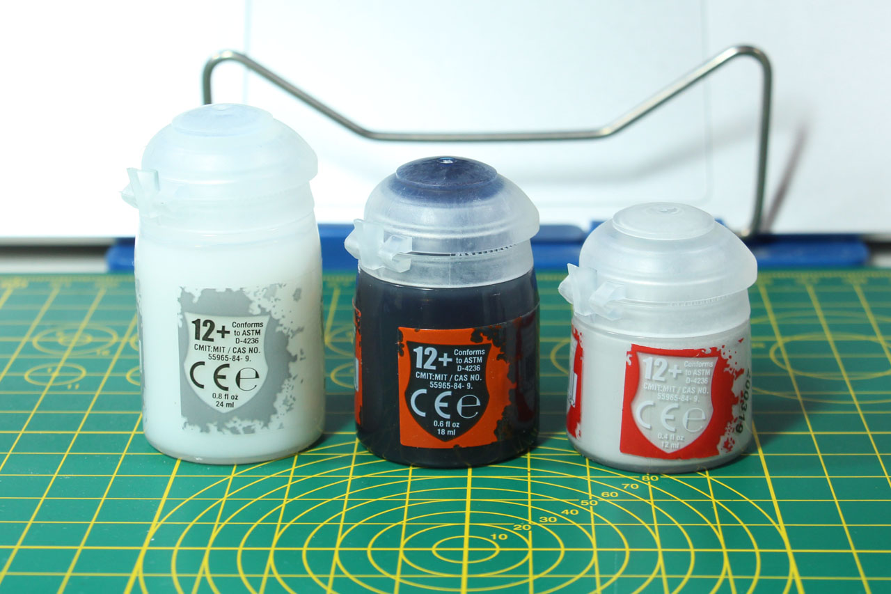
With the introduction of Contrast Colours to the Citadel paint range, we see 34 different Contrast paints, two new primers and a new medium. Depending on what type of colour you buy, you receive either 12, 18 or 24 ml in a flip-top paint pot. Regular paints are usually in the small 12 ml pots, the new Contrast Colours come in 18 ml pots and the technicals usually come in 24 ml pots. Games Workshop offers the two primer colours as a non-glossy base colour, for touch ups.
Where do we begin? Well, with the most basic thing there is to painting - the primer.
You could talk hours about choosing the right primer, and the argument goes back quite far into the early days of painting miniatures. There is not right or wrong, more like different school of thoughts and recommendations of what to use, depending on your paint style. The most basic differentiation would be, if you use a dark colour scheme or lot of metallics, use a dark primer. If you have light, bright and / or vivid colours, go with a lighter colour, like a medium grey or flat white primer. You can mix them, to give your miniatures a pre-highlight, called zenithal primer. That means you prime the miniature for example in a dark or black colour and give it a second, angled go with a lighter / white primer, to point out the direction where the light comes from. The lighter primer only reaches the upper / more exposed parts of the miniature. Thus when you paint the miniature with a thin coat, shining through the thin layers of paint, already giving you a bit of shading / highlights. Back in the day Games Workshop offered Chaos Black and Skull White as spray cans, with the occasional, seasonal different spray can for Blood Angels or such. Nowadays, we have a broader range to choose from, incl. metallics. Light grey primers are very popular in model building, and are a more thankful basecoat for lighter or difficult colours like yellow, without being too bright, preparing for a more "calm" look.
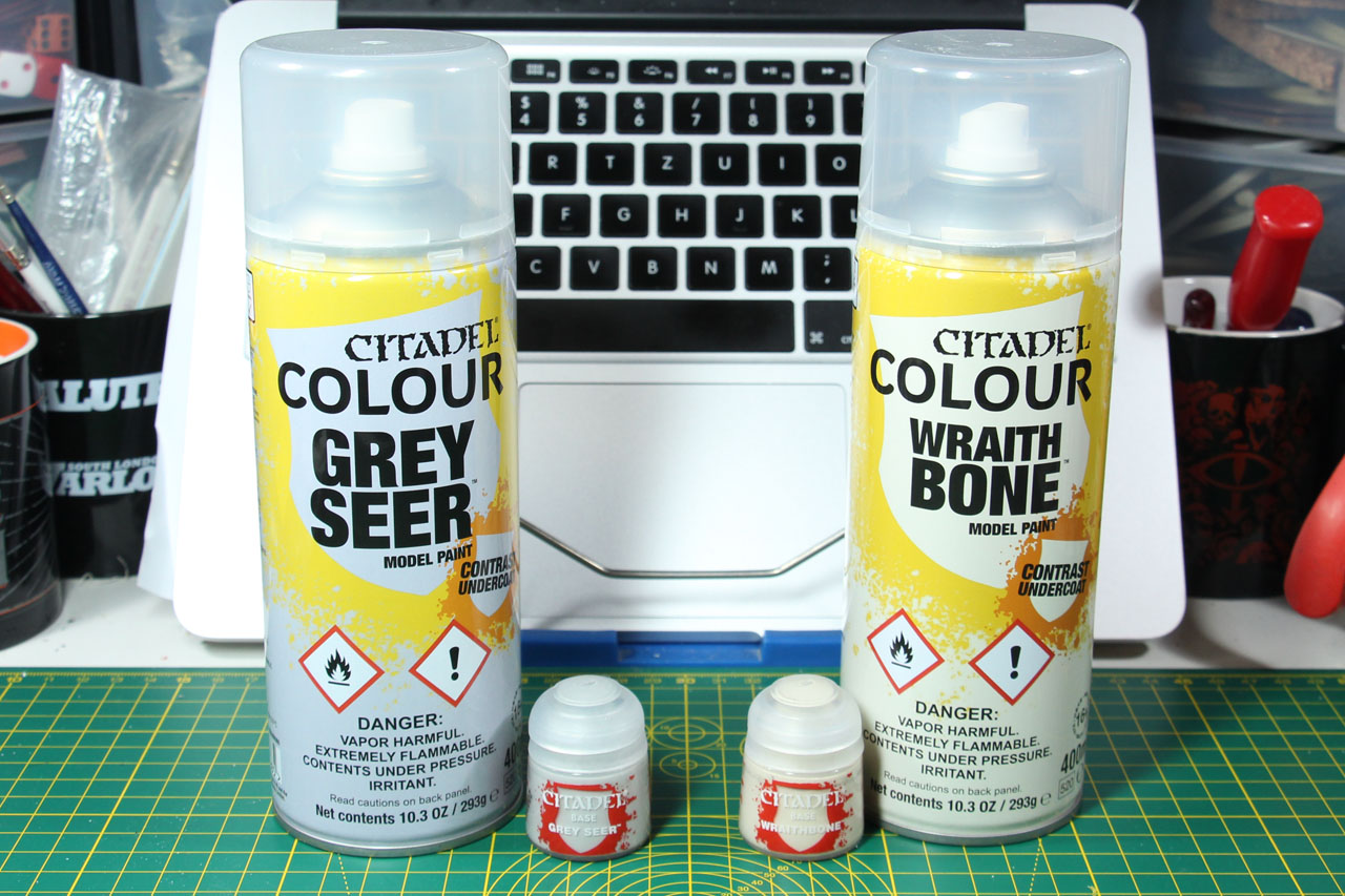
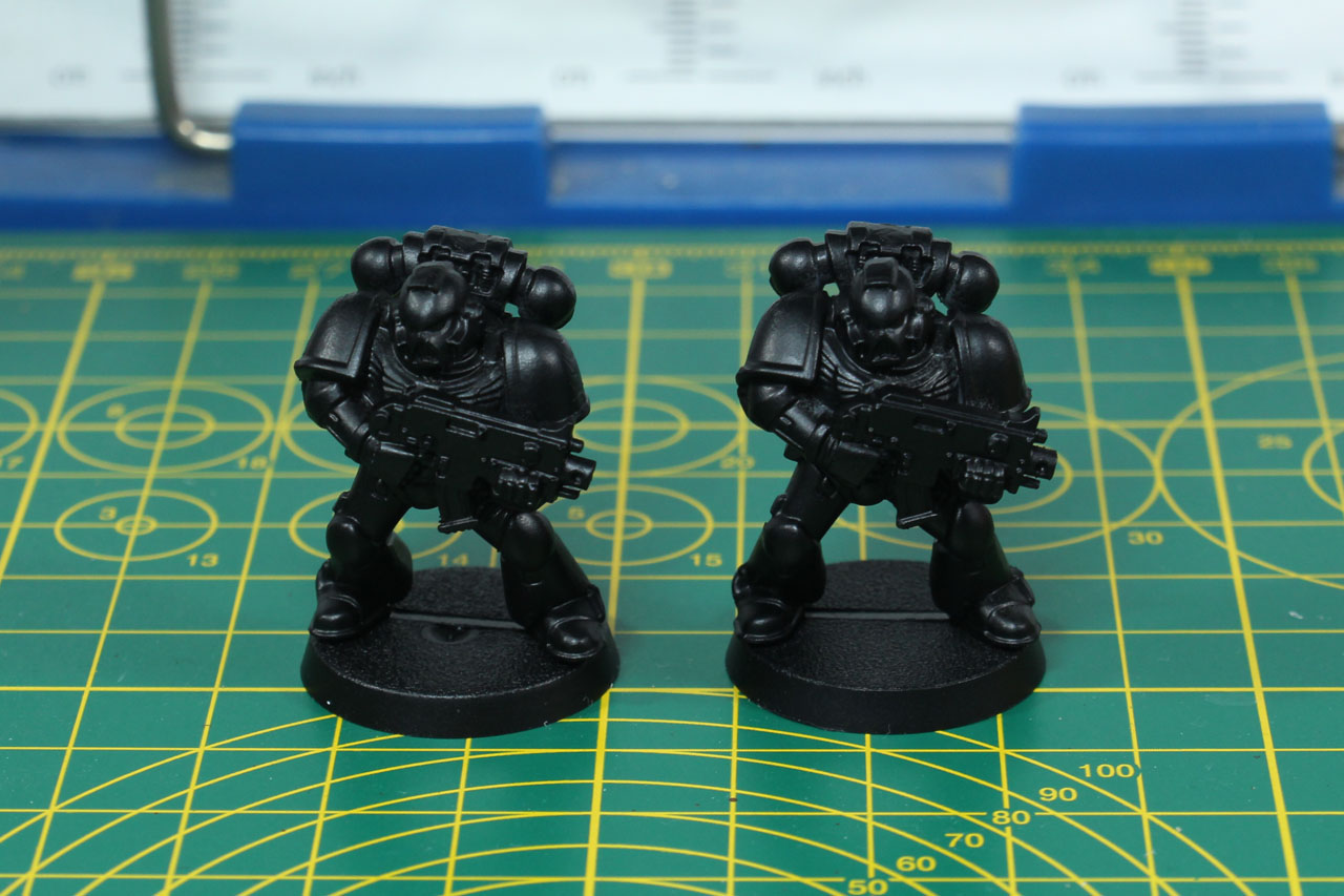
With that out of the way. What is it with the two new primers Grey Seer and Wraithbone that were "especially" made for use with Contrast Colours. Is this just a marketing trick or money grab? No it isn't, as they are actually meant to be used with Contrast Colours. Why is that? Well, see below, I primed multiple Space Marines with different spray cans. It is very important to point out that a proper preparation and handling of the primer is key to a proper paint job - regardless if you are going for a 3 base colour up or Golden Demon entry. So make sure to clean all those mould lines, shake the bottle properly, make sure it is neither to cold or hot where you're spraying and that the distance between can and miniature is appropriate.
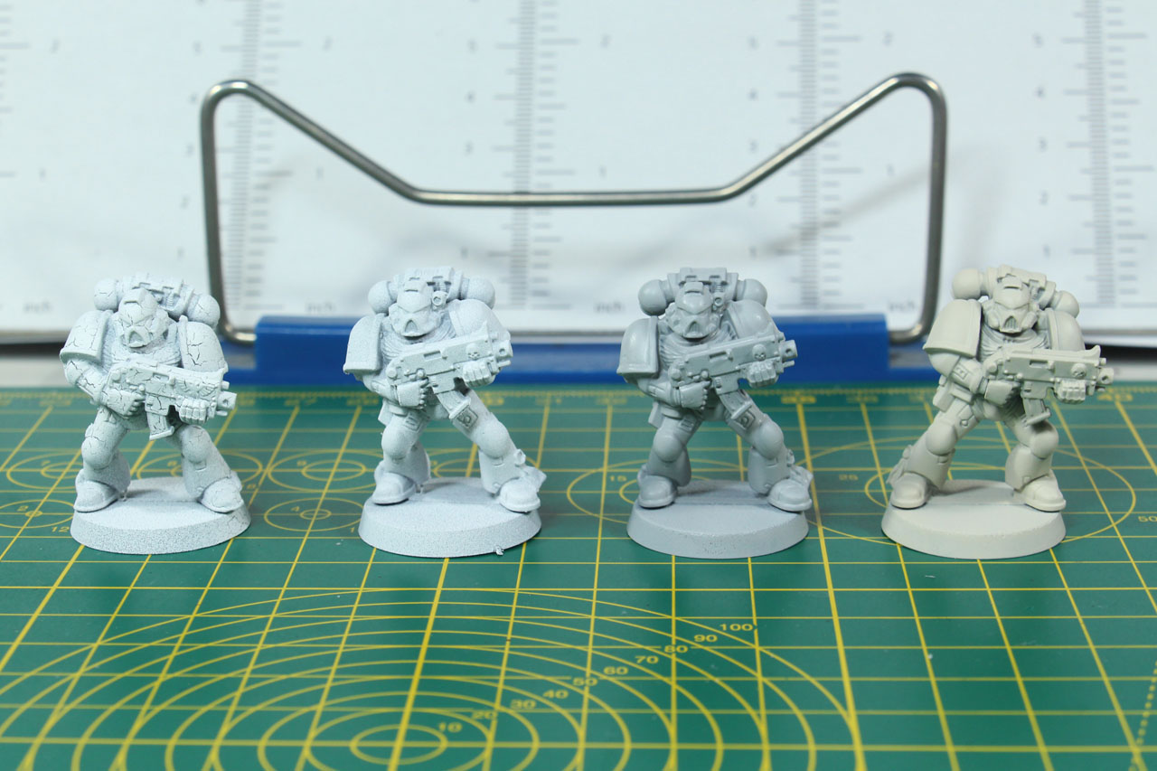
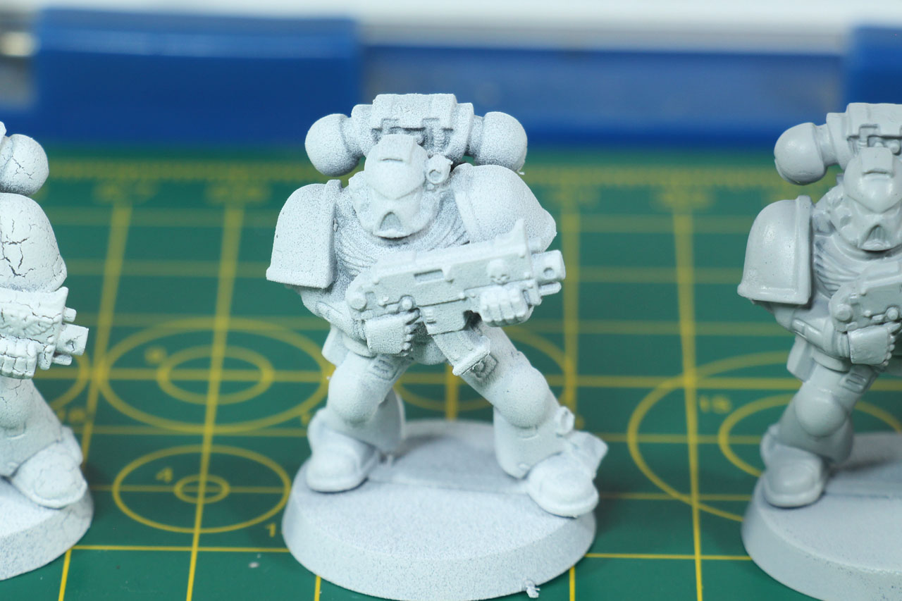
In the picture you can see the Space Marine on the left, the white colour is crackled. The primer wasn't shaken enough beforehand and was an old colour, where there was nearly no propellant left. The second Space Marine was primed using a regular flat white primer. You can see that the texture is a bit rough, which isn't a bad thing, as it helps the colour to grip to the surface / coat of primer. The next two Space Marines on the right were primed using Grey Seer (the light-grey colour) and Wraithbone (they slightly warmer, bone colour). As you can see the Contrast primers have a slight glossy finish. Usually not something that I'd be after, but in combination with the Contrast Colour a beneficial trait for the "runny" paint to properly flow over the surface, into the nooks and crannies. Leaving only a thin coat on the edges, a moderate residue on the flats and stronger coat in the depth.
So long story short, if you rely strongly on just using Contrast colours (or paints of a similar type), the special primers make sense. If you prefer Grey Seer or Wraithbone depends on the final look you're going for, either colder or warmer finish. Please note, Grey Seer is (or at least was) available as a regular matt primer. Citadel spray primer are between 13,50 EUR and 22,00 EUR RRP.
Now that we have sorted out the primer, let us take a look at the paints.
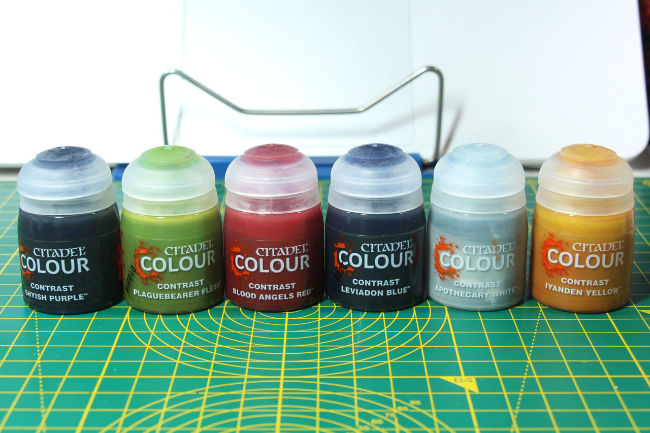
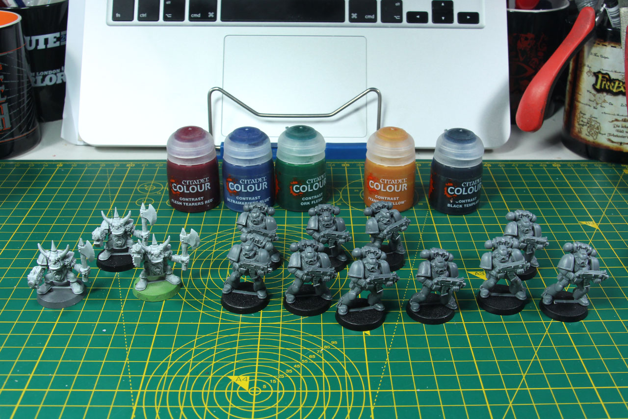
With currently 34 different contrast colours to choose from, the range covers from different skin tones, to blues, reds and greens even a black (Black Templar) and white (Apothecary White). I am aware that there are professional painting tutorials, with 20 coats of thinned paint and such, to show the (possible) use of Contrast colours. But as their main focus is getting miniatures battle ready quickly and they were advertised with "One thick coat" that's were the focus in this article is. So I want to see how fast and proper miniatures with a very dominant colour can be painted, for example like Space Marines that have a very present power armour. I want to see how the paint works for a Blood Angel and a Dark Angel. And beyond that, I want to try it out for some of the more difficult to paint chapters, like Imperial Fists (yellow is a bit of challenge not to look dirty and to properly cover) and Black Templars (ever tried to shade black?).

So let's get back to the primed Space Marines and give those paints a try. Similar to the preparation of the miniature and proper handling of the spray cans, it is important to keep that in mind with the paints as well. Make sure they are properly shaken and the pigment is well distributed. If you come across trouble with that, either give the paint an additional stir with a coffee stick or add a shaker (stainless steel balls).
The idea of contrast paints is to tint the coat beneath, so you're not bound to use just Grey Seer and Wraithbone. You can use Corax White (flat white), coloured primers or even metallics. So let's try the colours out, as mentioned above I want to try out a Dark Angel and a Blood Angel. So let's take one Space Marine primed with Grey Seer (left) and one with Wraithbone (right), and use a green and red on them. As the colours look much darker in the bottle, I actually overlooked the Dark Angels Green and Blood Angels Red, and used Ork Flesh and Flesh Tearers Red instead.
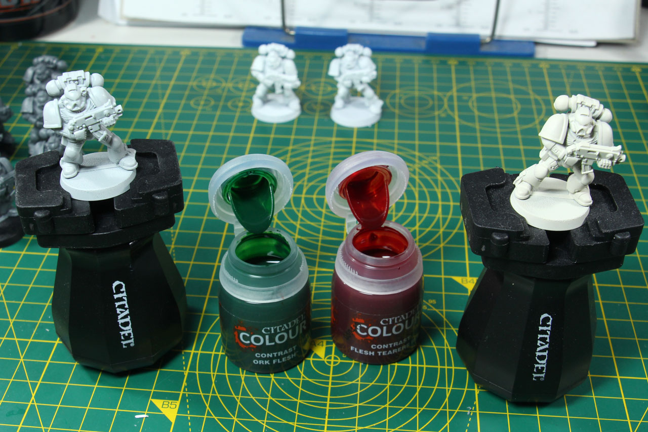
A good shaking and then applied in a single coat directly onto the models. A fresh coat is quite glossy and you can use a (wet) brush to move pigments from areas where they pool. It takes them a bit to thoroughly dry, depending on how thick you applied it.
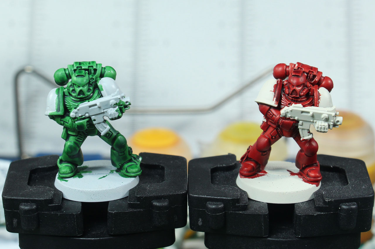
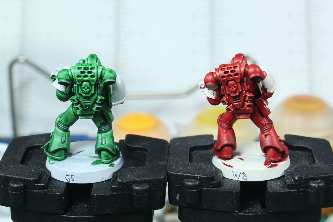
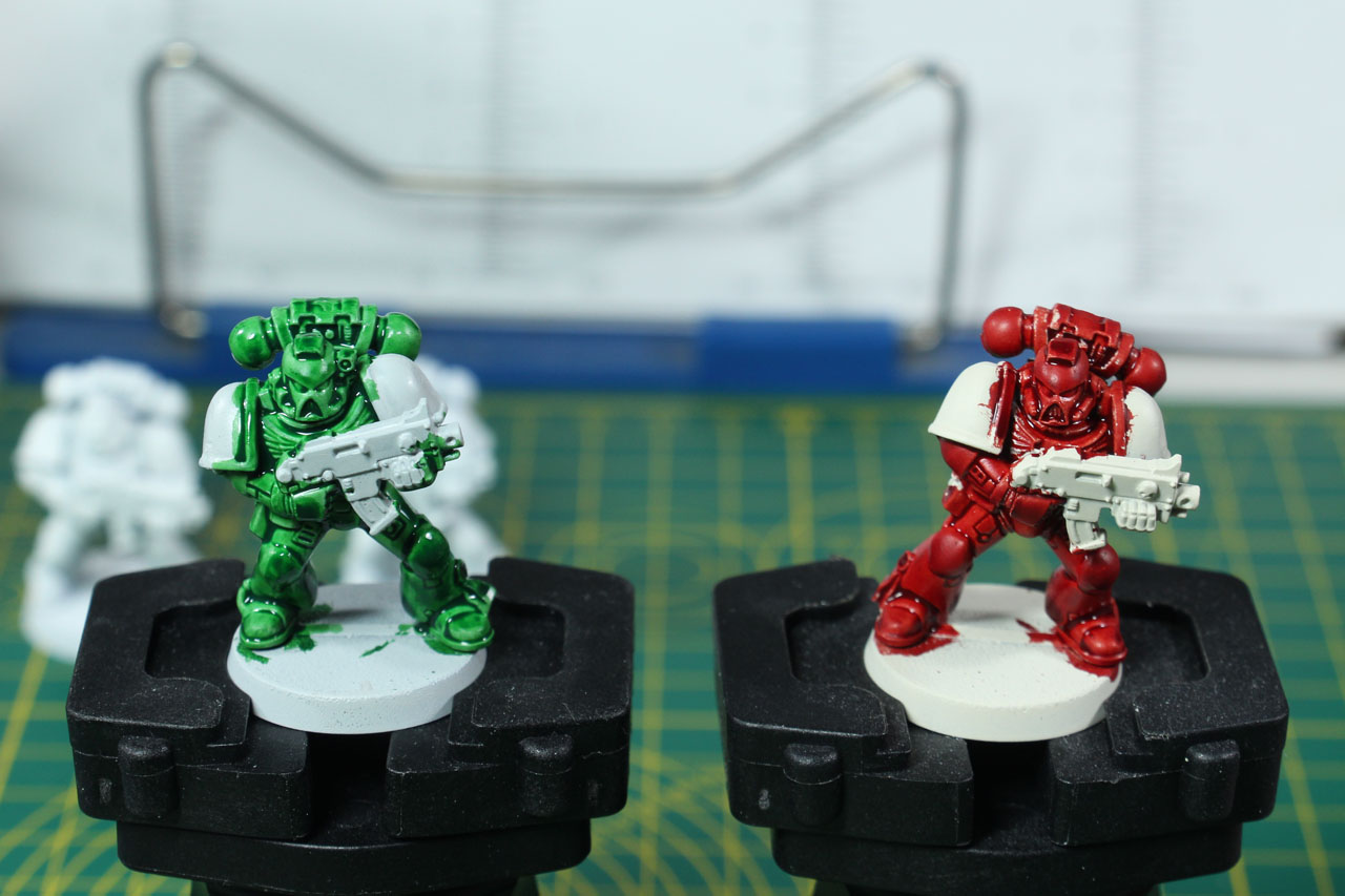
The Flesh Tearers Red is superb and covering properly. Not quite the Blood Angels colour, but would work superbly for Blood Ravens (wait for the next White Dwarf issue for more) or World Eaters. As for the Ork Flesh, it is less covering and lighter. It will work great as the name suggests, as Ork Flesh, and is clearly to light for Dark Angels, but would be great for the Aurora Chapter, Mantis Warriors or with a bit darker base colour / two coats for Salamanders. The dried paint is less glossy than I expected, as during the curing of the paint it looked like it would be. Lighter colours seem to be more prone to pooling. That is mostly due to the harsh contrast it creates, as the difference between lighter and darker parts is less on darker colours. It takes a bit of practise to get it right, but it works quickly. So use the chance at a store to do so or on some spare miniatures, to get the hang out of it.
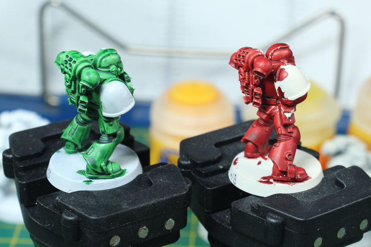
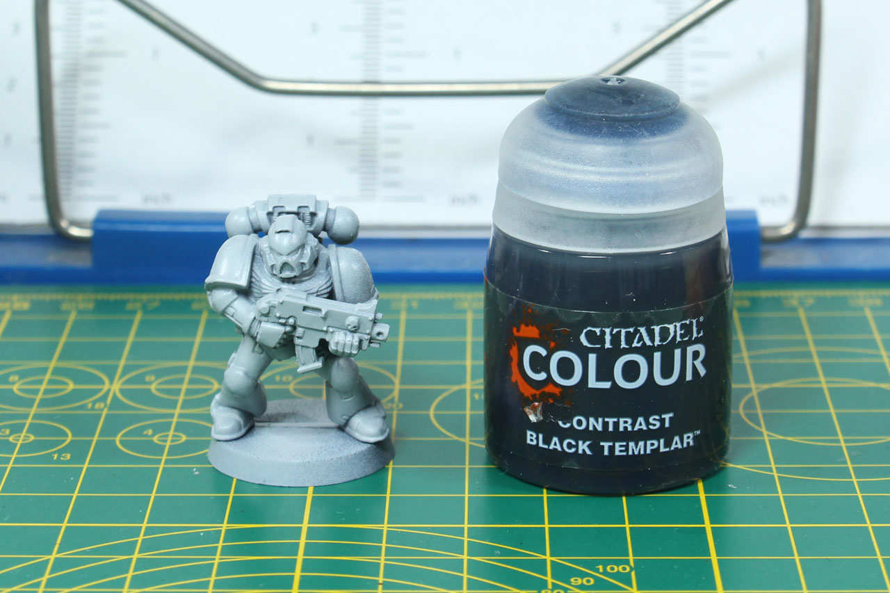
Black Templars are another Space Marine chapter that sounds easy to paint at first. But if you prime it in black, shading is difficult, and highlights are a bit of challenge, as you have to add clean edge highlights and not just a dry brush, as that tends to result in a rather dusty finish. So beginning with a Grey Seer primer, I went for two coats of Contrast Black Templar. Coat 1 in the middle picture and the second coat on the third picture. I guess that if you start out with a darker grey (maybe already with a lighter drybrush to point out the highlights) and used a single coat of Black Templar, you will have a battleready and quick result. Black Templar can be used for black lining as an alternative to thinned down paint or a regular Wash like Nuln Oil.


Now for the special "stuff", the technicals.

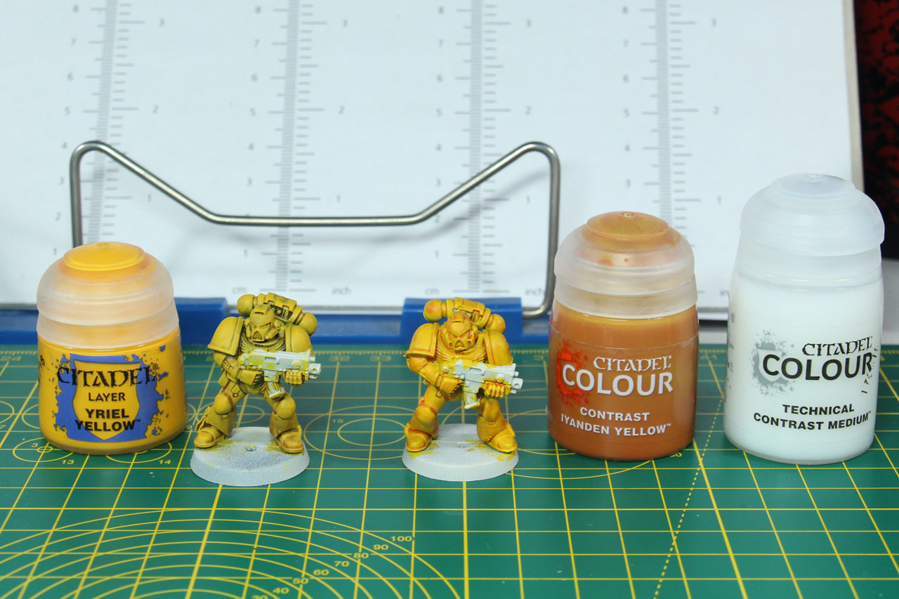
For the regular paints there is Lahmia medium, for the contrast paints, as they have a different composition, they use a different medium. With Contrast Medium you can thin down the contrast paint without changing its flow. Stormshield and 'Ardcoat are both varnishes, to be used as a final coat over the miniature to protect the miniatures paint job. Where show case miniatures will spend most of their time in a cabinet, gaming miniatures will often be taken out and put back in a foam case and touched while playing. So especially for the later it makes sense to use a varnish. The difference between Stormshield and 'Ardcoat is that the one is glossy and the other flat.
As contrast colours tend to have a glossy finish, you might want to use Stormshield for a flat finish. It is less glossy, than I expected, to be honest. But it is worth noting, due to the nature of the Contrast paint, the coat is thinner than regular paint, so it rubs off more easily from the glossy primer. Consider giving it a coat of varnish either way.
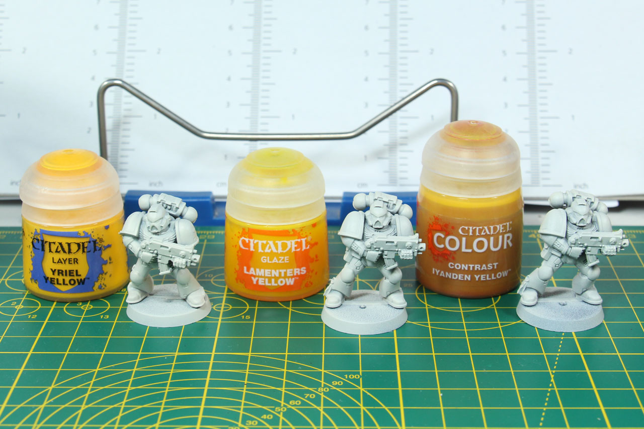
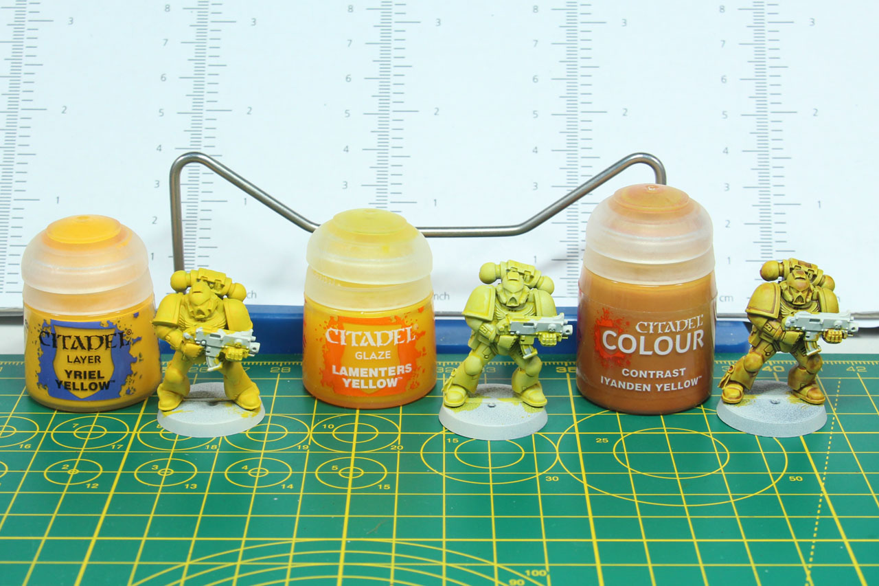
For the Imperial Fist I went with a side by side comparison. Three Marines, all of them primed with Grey Seer, but then threated with base paint Yriel Yellow, with the discontinued glaze Lamenters Yellow and the contrast Iyanden Yellow. I am quite amazed by the covering of both the base paint and the contrast paint. Side note, the base paint coated the glossy primer quite well. The contrast dried a bit "dirty", so I went for step 3. With a drybrush of Yriel Yellow on the Contrast coat and a 50/50 contrast / medium mix on top of the base painted one. I like the result the contrast with an added drybrush / highlight creates. It cleans up the first coat as well, so along with a bit of black and red, you can get a quick Imperial Fist. As for the medium one, you can clearly see that the coat is lighter, thinner, but needs more control and the result is similar like a stronger wash.
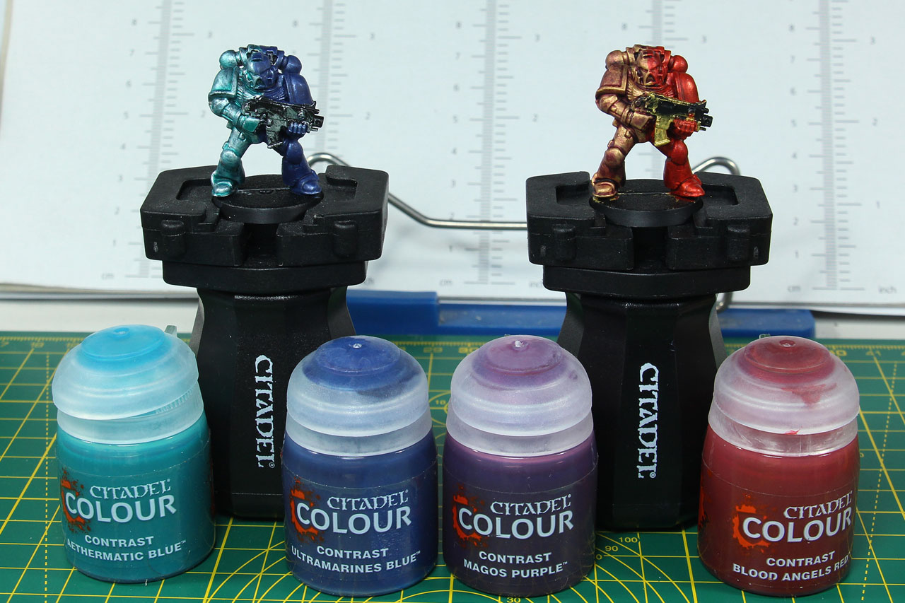
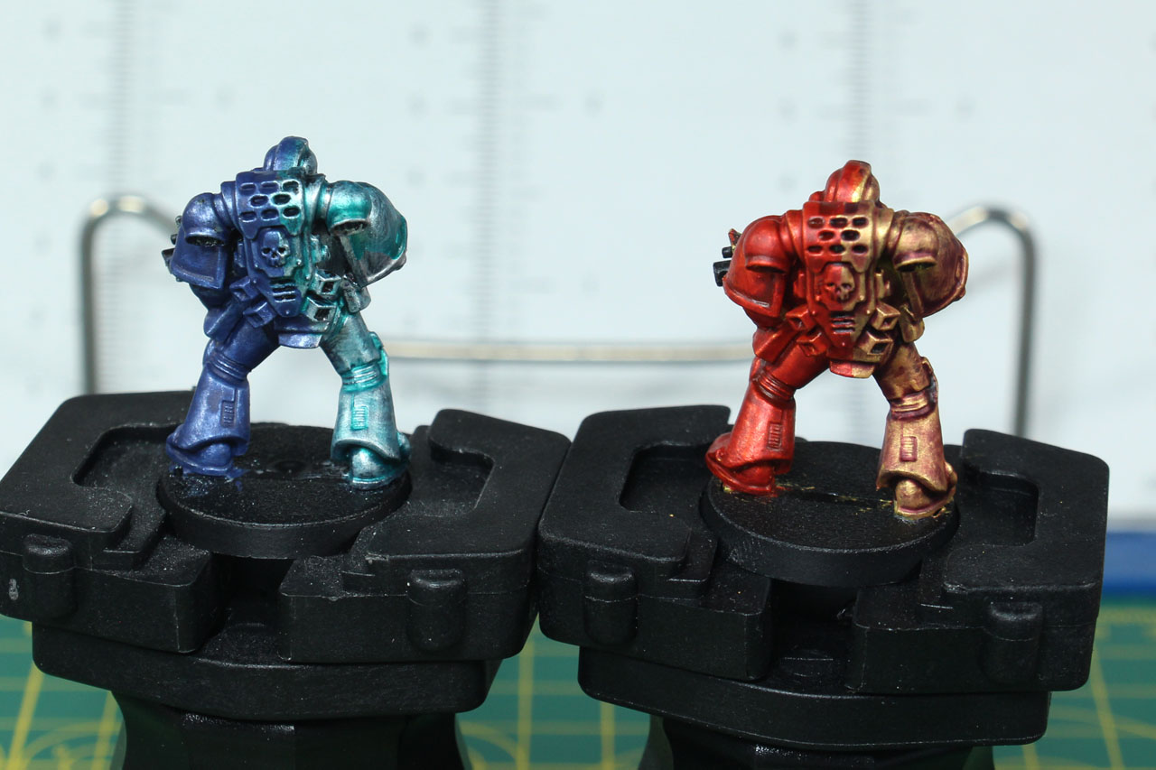
Next test is to see how the colours work on metallics. I have seen some on Facebook applied by airbrush. As metallics look best, if you use a black underground I gave them a flat black coat and painted one in gold and one in silver. Each will get a half-and-half paint job, the golden one with Magos Purple and Blood Angels Red, and the silver one with Ultramarines Blue and Aethermatic Blue.
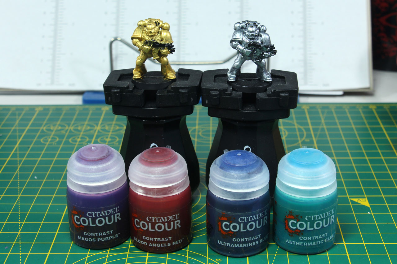
The Ultramarine Blue and Blood Angels Red cover superbly. The blue is quite thick, so you have so keep an eye on pooling. Unfortunately the two other colours, Magos Purple and Aethermatic Blue don't really supply a proper coverage and are very light. I did an additional test on flat white, and you can see both colours are very light even there. Still, I think the combination of a metallic base with a contrast on top would work for a couple of projects, especially Blood Angels Red on Metallics for Thousand Sons pre-heresy and with Ultramarine Blue for post-heresy Thousand Sons. The other two paints could work for Slaanesh Chaos Space Marines, especially the Magos Purple for Emperors Children. It's a shame that the Magos Purple didn't work on the metallic, as I could have seen that work for Night Lords.

Conclusion
I am amazed by the coverage of some of the new paints. Unfortunately it is not consistent across the whole range, there are some rogue results, as you saw above, but some of the usually more problematic colours like yellow or red work surprisingly well. Does it hold its "promise", one thick coat and you're good to go? It depends. It depends on multiple factors. The most obvious is, what kind of miniatures you're painting. The concept of these inks/washes, to tint the surface of a model works well with miniatures that give you a proper surface to do so. That means, armies with miniatures like Poxwalkers, Skeletons and such, are a very welcome project. Miniatures with lots of cloaks and flowing cloths might look dirty, as the surface will make pooling more likely. Same goes for vehicle heavy armies. So your Eldar Jetbikes or Space Marine tanks are less of a good canvas for Contrast paints compared to for example Tau Battle suits. But beyond the citadel miniature range, there are multiple historical ranges that will benefit from contrast paints.
The other factor is, does it suit your technique or painting style. If you're already prone to using washes, and I mean washes, not glazes or other "high-end" styles, this is definitely an interesting addition to your tool box. The quick coating of the mid to darker Contrast tones, give you quite an edge on speed, but the final result of your miniature will become much better, by two things. The first being taking the time for clean ups, highlights and drybrushing, and the second taking the time to get to know how to handle the colours, meaning brush control. Brush control is something that you should learn if you work with any kind of washes. It helps you to prevent pooling, to produce a cleaner, less messy finish and to move the pigment within the colour where you want them. Taking time of additional shading and highlighting processes.
About the price. Citadel tools never were cheap, the only exception being the Citadel paint handle. The regular paint pots (base, dry, most of the layers) are 3,60 EUR for 12ml (3 EUR per 10 ml), the shades (former washes), technicals and airs are 6,30 EUR for 24 ml (2,63 EUR per 10 ml), so Contrast with 6,30 EUR for 18 ml is another price raise (at 3,50 EUR per 10 ml). That's 15% more than regular paint and 25% more than other large pot paints, and that's just the comparison within Citadel / Games Workshop product range. Along with the glossy primer that type I recommend to be used with contrast paints that adds up and takes a certain degree of commitment towards that painting method. And you will need some sort of varnish if the contrast paint is among the top layers of your paint job, as it is more likely to rub off compared to other paints.
One last thing that I like to point out, and that is the fact that this is a product, aimed to cut down preparation time for painters. And that is a good thing, for multiple reasons. Painting accessories often are focused on "artisan painters" or towards competition painters. Contrast, if used properly, is even faster than the Fast-Army-Painter technique, and that is a really good thing. Because even if our hobby stands on multiple pillars (usually four, building, painting, collecting and gaming), not every one of those is of the same importance for and to every hobbyist. And if it helps you and others to get quickly through those steps, to get your miniatures on the table at a halfway decent result or something that you are satisfied with, be my guest. Because every kit that is not painted and not being used somewhere on a table, is a unit or model being not used or game not being played that could draw someone new into the hobby, helping our niche hobby grow. And with the offline (trading card, roleplaying and board games) and even harder online (all sorts of casual to not so casual video and mobile games) competition, every little bit that helps making our tabletop hobby more competitive and accessible is something that is welcomed by me.
This is not the end of the coverage on Contrast, there will be a third article, collecting further feedback that I found interesting, and beyond that I'll use and give the colour a try on projects, where the battleready paint level will either be enough or the technique can be used to its full potential. Like some Underworlds bands and the Nurgle Rotters Blood Bowl Team. And I'll try out the tutorial on the Sylvaneths of Ylthari's Guardians by Mengel published on Warhammer Community.
Citadel Colours is a brand by Games Workshop.
The reviewed product item was provided by the manufacturer.
Enjoy this article?
Like us on Facebook

Follow me on Instagram

Categories
- events (205)
- fantasy (596)
- General (160)
- historical (631)
- Little Big Adventures (4)
- offtopic (5)
- reviews (535)
- science fiction (680)
- showroom (107)
- terrain (115)
- work-in-progress (415)


July 18th, 2019 - 21:16
magos purple didnt work on gold because yellow (gold) and purple are on opposite sides of the colorwheel… apply magos purple on a silver instead.